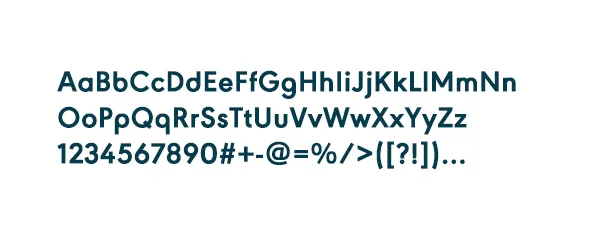
Logo
Overview
Use the guidelines below to ensure an accurate representation and use of our logo.
Scale
The logo height should never be smaller than 0.3 inches in print and 70px in digital.
Logo Guidance
It's important to keep the logo appearance consistent and not cause any modifications or alterations to it's shape, color, or form.
For light backgrounds use the green logo
For green background use the white logo
For darker backgrounds use the white logo
Don't stretch or manipulate
Don't type out the logo
Don't use off brand colors
Colors
Primary
Green
RGB - 0 213 134
CMYK - 68 0 68 0
HEX - 00d586
Yellow
RGB - 255 210 101
CMYK - 1 17 71 0
HEX - ffd265
Dark Blue
RGB - 6 60 77
CMYK - 96 67 50 41
HEX - 063c4d
Greyscale
Neutral 1000
RGB - 4 45 58
CMYK - 95 94 54 56
HEX - 042d3a
Neutral 900
‍
RGB - 8 51 65
CMYK - 94 68 53 50
HEX - 083341
Neutral 750
RGB - 12 66 84
CMYK - 94 65 48 36
HEX - 0c4254
Neutral 700
RGB - 53 89 100
CMYK - 82 54 48 25
HEX - 355964
Neutral 600
RGB - 87 111 118
CMYK - 69 47 44 14
HEX - 576f76
Neutral 500
RGB - 133 149 154
CMYK - 51 34 34 1
HEX - 85959a
Neutral 400
RGB - 184 194 196
CMYK - 28 17 19 0
HEX - b8c2c4
Neutral 300
RGB - 218 226 227
CMYK - 13 6 8 0
HEX - dae2e3
Neutral 200
RGB - 244 251 252
CMYK - 51 34 34 1
HEX - f4fbfc
Secondary
Dark Green
RGB - 2 179 137
CMYK - 78 1 62 0
HEX - 02b389
Light Green
RGB - 220 247 238
CMYK - 12 0 8 0
HEX - dcf7ee
Light Yellow
‍
RGB - 255 243 214
CMYK - 0 3 17 0
HEX - fff3d6
Red
‍
RGB - 242 58 63
CMYK - 0 92 77 0
HEX - f23a3f
Light Red
RGB - 255 233 234
CMYK - 0 10 3 0
HEX - ffe9ea
Color Guidance
Be aware of contrast
Avoid color overlays
Use greyscale colors for text
Typography
Vusemod Bold
The foundation of our logo, and the font we use for all headers in communication.
Roboto Regular
We chose Roboto as our typeface for paragraphs and long form text, for it's compatibility, and popularity.
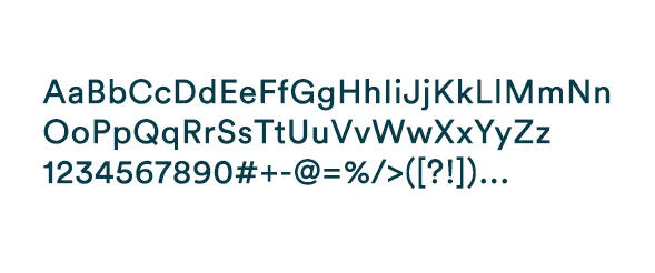
Circular Std
The newest edition to our typefaces, used exclusively on our website.
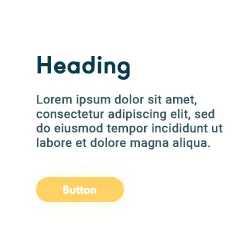
Hierarchy, Size and Spacing
In addition to the hierarchy structure presented above, please also maintain the following sizing and spacing rules.
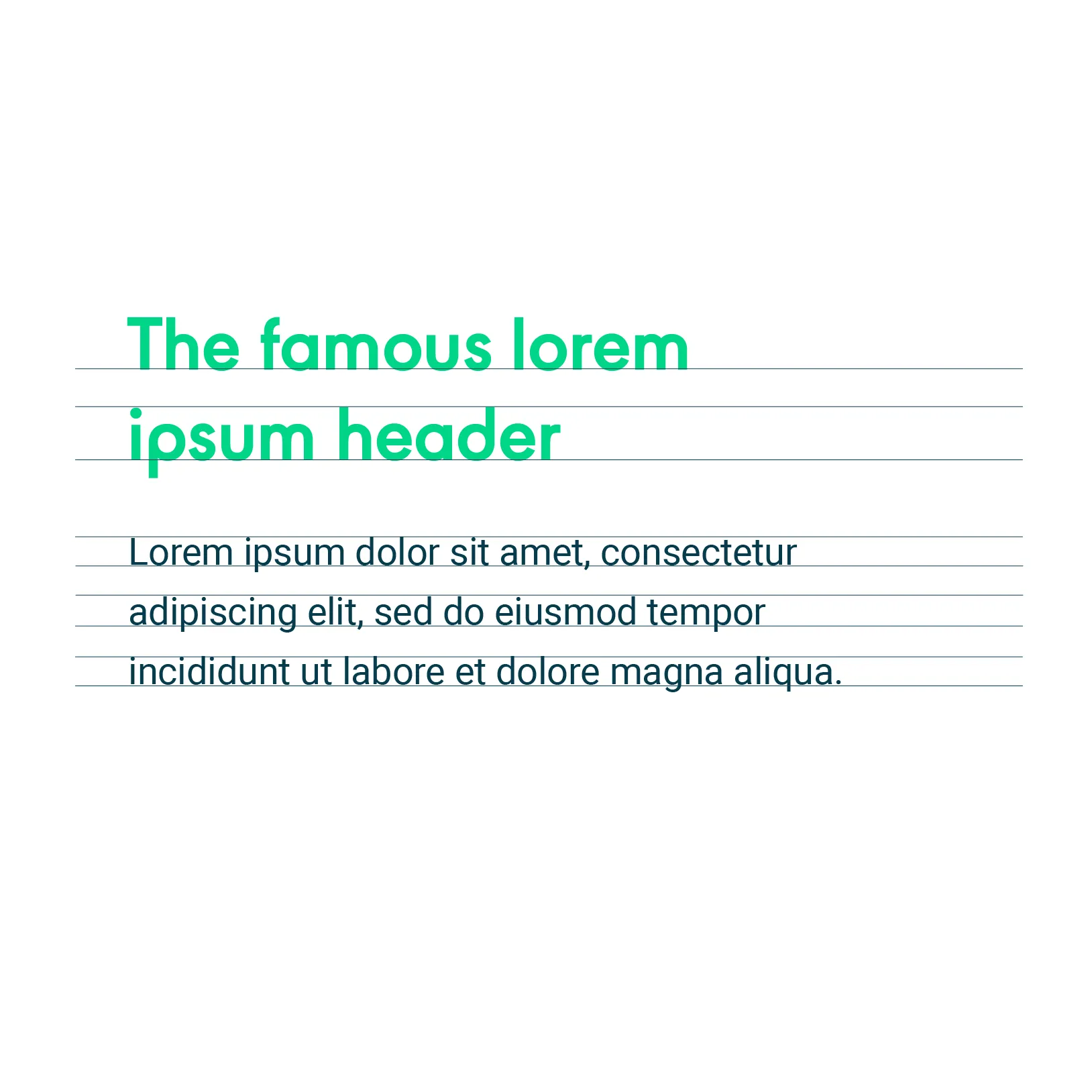
Paragraph is 2.1x smaller than the header
Header line height is 1.15x font size
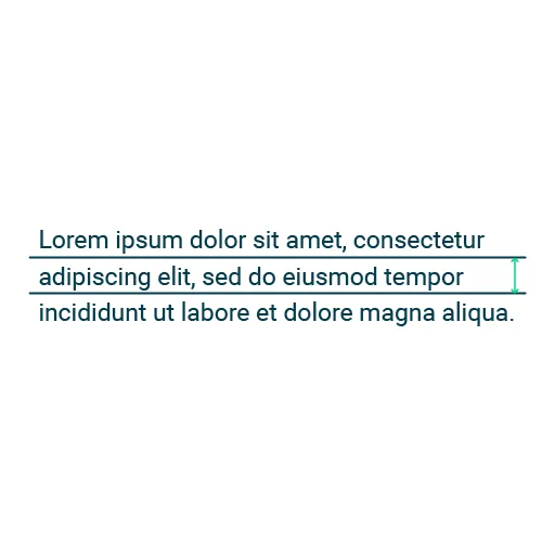
Paragraph line height is 1.6x font size
Typography Guidance
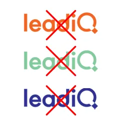
To maintain the typography appearance, it's important to follow the guidelines and not cause any changes to the font, hierarchy, or structure.
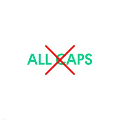
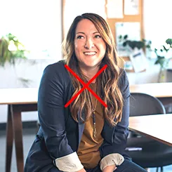
Don't shout (e.g. use all caps)
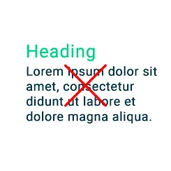
Wrong use of font, space, and hierarchy
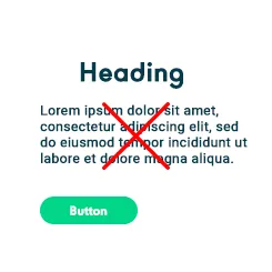
Use consistent alignment
Shapes
Philosophy
Much the same as primitive shapes are the foundation of the world around us, we see LeadIQ to be the building block of the world's greatest sales teams.
Primitives
Bright green circle
Dark blue square
Yellow triangle
Combining Shapes
Shape Guidance
While combining shapes creates room for a lot of creativity, it's crucial to keep the appearance within the brand guidelines.
Use proportionate shapes
Maintain a balanced composition
Use brand colors only
Photography
Overview
Our images represent the everyday work environment of sales professionals, executives, and their prospecting workflow.
Photography Guidance
Through images, we form trust, and build stories that make an impact.
Don't use heavy contrast
Avoid cropping faces
Don't use heavy exposure
Composition
Overview
We combine colors, patterns and photography to create unique shapes that breathe life to our brand.
LeadIQ shapes with images of sellers scattered within
LeadIQ shape example with BOLD text and image of woman
Composition Guidance
Avoid duplicate color order
Maintain image to shape ratio 1:1 I 1:4 I I 1:8 I 1:16
Keep the shapes aligned